
“Add” and “Edit” again and again…
In most applications, managing “Add” and “Edit” operations is a fundamental requirement. At first, I created separate modals for each entity—users, products, and orders—thinking it was the simplest approach. How this approach becomes increasingly difficult to maintain as the number of entities grows and leads to these problems:
The problems
- Code Duplication: Each entity (users, products, orders, etc.) requires a separate dialog for both adding and editing.
- Inconsistent UI/UX: Since each dialog is manually created, UI inconsistencies may arise across different components.
- Increased Maintenance Overhead: Any UI or functional update to modals needs to be replicated across all individual dialogs.
What’s the typical Alternatives?
–Separate Add & Edit Dialogs
✅ Pros: Allows complete customization for each dialog.
❌ Cons: Leads to repeated code, inconsistency, and increased maintenance efforts.
–One Generic Dialog but Manually Configured Per Page
✅ Pros: Reduces some duplication.
❌ Cons: Still requires repetitive setup, and developers may need to pass multiple props repeatedly.
–Custom Hook for Dialog Logic
✅ Pros: Helps manage dialog state and form submission logic efficiently.
❌ Cons: Still requires individual dialogs per use case.
A more scalable approach is to use a single, opinionated dialog component that dynamically adapts based on whether it’s being used for adding or editing. This ensures consistency while reducing redundancy, making it easier to maintain in the long run.
Introducing MutableDialog
The MutableDialog component addresses these challenges by offering a structured way to handle both “Add” and “Edit” operations within a single, reusable dialog box. It integrates seamlessly with React Hook Form and Zod for validation, ensuring robust form handling.
This dialog component is “opinionated”—it follows a defined pattern that standardizes dialog interactions. While it simplifies development in many cases, it also comes with trade-offs, which we’ll explore later.
Core Features:
- Dynamic Behavior: Determines whether it’s in “Add” or “Edit” mode based on the presence of default values.
- Standardized UI: Ensures a consistent user experience across different forms.
- Validation Support: Uses Zod schemas to enforce validation rules.
- Reusable Structure: Accepts custom form components, allowing flexibility within a predefined framework.
Boosting your Productivity with ActionState<T>, Toast Notifications, and Type Safety
The MutableDialog component also includes several features that improve error handling, user feedback, and code maintainability.
1. ActionState<T> for Standardized Server Responses
The ActionState<T> interface provides a structured way for backend or server actions to communicate success or failure messages to the frontend. This ensures consistency in error handling and additional data processing upon success.
export interface ActionState<T> {
  success: boolean;
  message: string | null;
  data?: T;
}- Consistent Error Handling: Since the backend always returns a standardized response, developers don’t need to manually check response formats.
- Predictable Behavior: Ensures that every action (add/edit) provides a clear indication of success or failure.
The data property in ActionState<T> allows additional information to be returned from server actions. This flexibility is useful for uUI updates or logging.
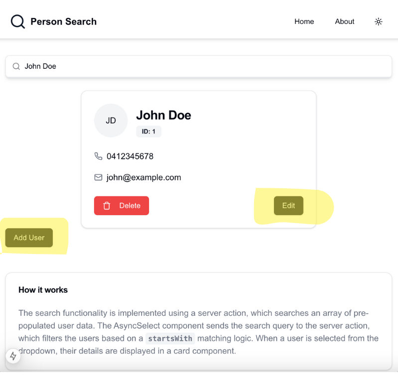
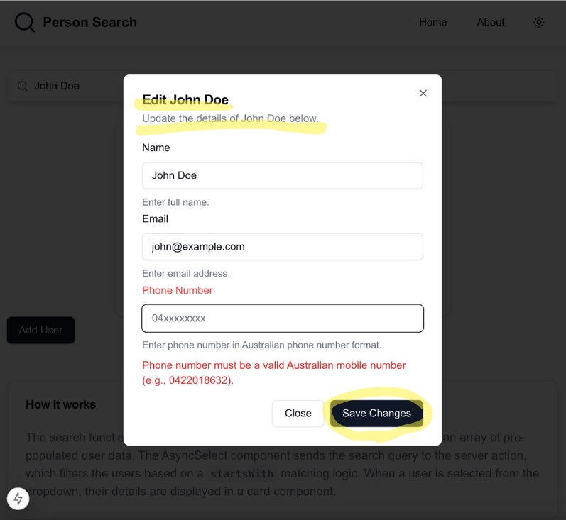
Use Case: Update Person info
Imagine a Person Search feature where admins can update a user’s details (e.g., name, email). Instead of just confirming the update, we return the updated user object so the UI can reflect changes immediately.
Here’s how a server action might handle this:
export async function editUser(data: { userId: string; name: string; email: string }) {
  try {
    const updatedUser = await prisma.user.update({
      where: { id: data.userId },
      data: {
        name: data.name,
        email: data.email,
      },
    });

    return {
      success: true,
      message: "User updated successfully.",
      data: updatedUser, // Returning updated user object
    };
  } catch (error) {
    return {
      success: false,
      message: "Failed to update user.",
    };
  }
}
Integrating with MutableDialog in Person Search
When the edit action runs, we update the UI immediately with the returned user data.
export function UserEditDialog({ user }: UserEditDialogProps) {
  const handleEditUser = async (data: UserFormData): Promise<ActionState<User>> => {
    try {
      const updatedUser = await updateUser(user.id, data)
      return {
        success: true,
        message: `User ${updatedUser.name} updated successfully`,
        data: updatedUser,
      }
    } catch (error) {
      return {
        success: false,
        message: 'Failed to update user' + (error instanceof Error ? error.message : String(error)),
      }
    }
  }
 }
Instead of just returning a success/failure status, returning the updated object allows the frontend to display the latest data immediately, reducing the need for additional API calls. This approach ensures a seamless user experience with real-time updates.
Explore Person Search App on GitHub: https://github.com/gocallum/person-search
2. User Feedback with Toast Notifications
The MutableDialog component integrates with toast notifications using shadcn/ui’s toast hook. This provides instant feedback to users when an action succeeds or fails.
- Success Messages: When an operation is successful, users receive a confirmation message.
- Error Messages: If validation or server-side errors occur, users are immediately informed.
- Improved UX: Real-time feedback enhances user experience, preventing confusion and reducing unnecessary clicks.
if (actions.success) {
  toast({
    title: "Success",
    description: actions.message,
    variant: "default",
  });
} else {
  toast({
    title: "Error",
    description: actions.message || "Operation failed",
    variant: "destructive",
  });
}
3. Strong Type Safety with TypeScript Generics
By defining MutableDialog as a generic component with T extends FieldValues, we enforce type safety and flexibility across different forms. This approach ensures that:
- Form data structures are strongly typed, reducing runtime errors.
- Validation schemas (Zod) and form values remain synchronized, improving developer efficiency.
- Developers can reuse this dialog for multiple entities (users, products, etc.) without changing its core implementation.
export default function MutableDialog<T extends FieldValues>({
  formSchema,
  FormComponent,
  action,
  defaultValues,
}: GenericDialogProps<T>) {
Using TypeScript generics makes it easier to enforce constraints and validate form inputs at compile time, ultimately leading to fewer bugs and more predictable behavior.
Props Overview
MutableDialog accepts the following props:
- formSchema: A Zod schema defining the validation rules for the form.
- FormComponent: A React component responsible for rendering the form fields.
- action: A function to handle the form submission (e.g., adding or updating a user), utilizing
ActionState<T>to standardize responses. - defaultValues: Initial values for the form fields, used for editing existing data.
- triggerButtonLabel: Label for the button that triggers the dialog
- addDialogTitle / editDialogTitle: Titles for the “Add” and “Edit” modes.
- dialogDescription: Description displayed inside the dialog.
- submitButtonLabel: Label for the submit button.
This code defines the MutableDialog component that handles both “Add” and “Edit” operations dynamically by adjusting the dialog content based on whether default values are provided. Now, let’s look at how we can use this component in your application.
Usage Example
Here’s how you can use MutableDialog in your application:
Step 1: Define a Zod Schema
import { z } from 'zod';

const userSchema = z.object({
  name: z.string().min(1, 'Name is required'),
  email: z.string().email('Invalid email'),
});
Step 2: Create a Form Component
import { useFormContext } from 'react-hook-form';

function UserForm({ form }) {
  return (
    <div>
      <label>Name:</label>
      <input {...form.register("name")} />
      <label>Email:</label>
      <input {...form.register("email")} />
    </div>
  );
}
Step 3: Use MutableDialog in Your Page
import MutableDialog from './components/mutable-dialog';

export function UserDialog() {
  const handleAddUser = async (data: UserFormData): Promise<ActionState<User>> => {
    try {
      const newUser = await addUser(data)
      return {
        success: true,
        message: `User ${newUser.name} added successfully`,
        data: newUser
      }
    } catch (error) {
      return {
        success: false,
        message: 'Failed to add user ' + (error instanceof Error ? error.message : 'Unknown error')
      }
    }
  }

  return (
    <MutableDialog<UserFormData>
      formSchema={userFormSchema}
      FormComponent={UserForm}
      action={handleAddUser}
      triggerButtonLabel="Add User"
      addDialogTitle="Add New User"
      dialogDescription="Fill out the form below to add a new user."
      submitButtonLabel="Save"
      defaultValues={defaultValues}
    />
  )
}
Full tutorial of Mutable dialog can be found on this course : Click
Pros & Cons of MutableDialog
✅ Pros
- Simplifies Code: Eliminates the need for multiple modal components.
- Consistency Across UI: Provides a uniform experience for add/edit dialogs.
- Works Well for Standard CRUD Forms: Best suited for simple forms that require a dialog-based interaction.
❌ Cons
- Not Ideal for Complex Workflows: If additional business logic or multiple steps are required, this component might not be flexible enough.
- Limited Button Customization: If different button behaviors (e.g., separate “Cancel” and “Close” actions) are needed, additional modifications are required.
- Toast Notifications May Not Be Desired: If a project has a different notification system, the built-in toast functionality may be unnecessary.
Conclusion
By introducing a dynamic, reusable dialog component, I streamlined the way forms are managed across the application. This approach reduces redundancy, improves maintainability, and ensures a consistent user experience.
Whether you’re a solo developer looking to simplify your workflow or part of a larger team aiming for UI consistency, this solution provides a scalable and efficient way to handle “Add” and “Edit” operations seamlessly.
Relate Courses:

Leave a Reply