Author: Ayumi Nuguroho

  • Can GitHub Copilot Agentic Mode replace v0.dev?

    Can GitHub Copilot Agentic Mode replace v0.dev?

    It’s time to explore GitHub Copilot Agent Mode. With its recent release, I wanted to see if it’s as good as v0.dev and if it can help me build an app effortlessly. In this article, I’ll share my experience using GitHub Copilot Agent Mode to build an app. Additionally, I wanted to see for myself if it could automatically install dependencies like Shadcn/UI.

    Will it be my coding buddy?

    After reading GitHub’s press release, I was curious to see how it compared with v0.dev, something I use extensively for more than a year. To put it to the test, I’ll see if Copilot Agent mode can actually assist with building an app and managing my local environment.

    GItHub Copilot Agent Mode

    Build with GitHub Copilot Agent mode

    As a benchmark, I used this hello $name app, simple greeting app. The app would let users enter their name in a field and display a personalized greeting message. I have been able to give following instructions to build and deploy the app fully on Vercel cloud using v0.dev

    hello $name app on v0.dev

    Let’s go see how GitHub Copilot Agent mode can help me to build this app.


    Get start with GitHub Copilot Agent mode

    To get started, I needed to download VS Code Insiders. I followed the instructions on Visual Studio Code Insider to get it.

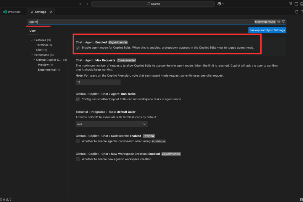
    Once I installed it, I opened the settings page, typed “Agent” in the search field, and checked the box to enable the Agent Mode setting for GitHub Copilot Chat.

    Enable Agent Mode on Setting page

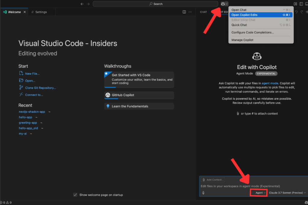
    Then clicked the copilot icon on the right of searching field on your editor. When in the Copilot Edits panel, switch from Edit to Agent right next to the model picker.

    Choose Edit chat from a top icon / Select Agent Mode

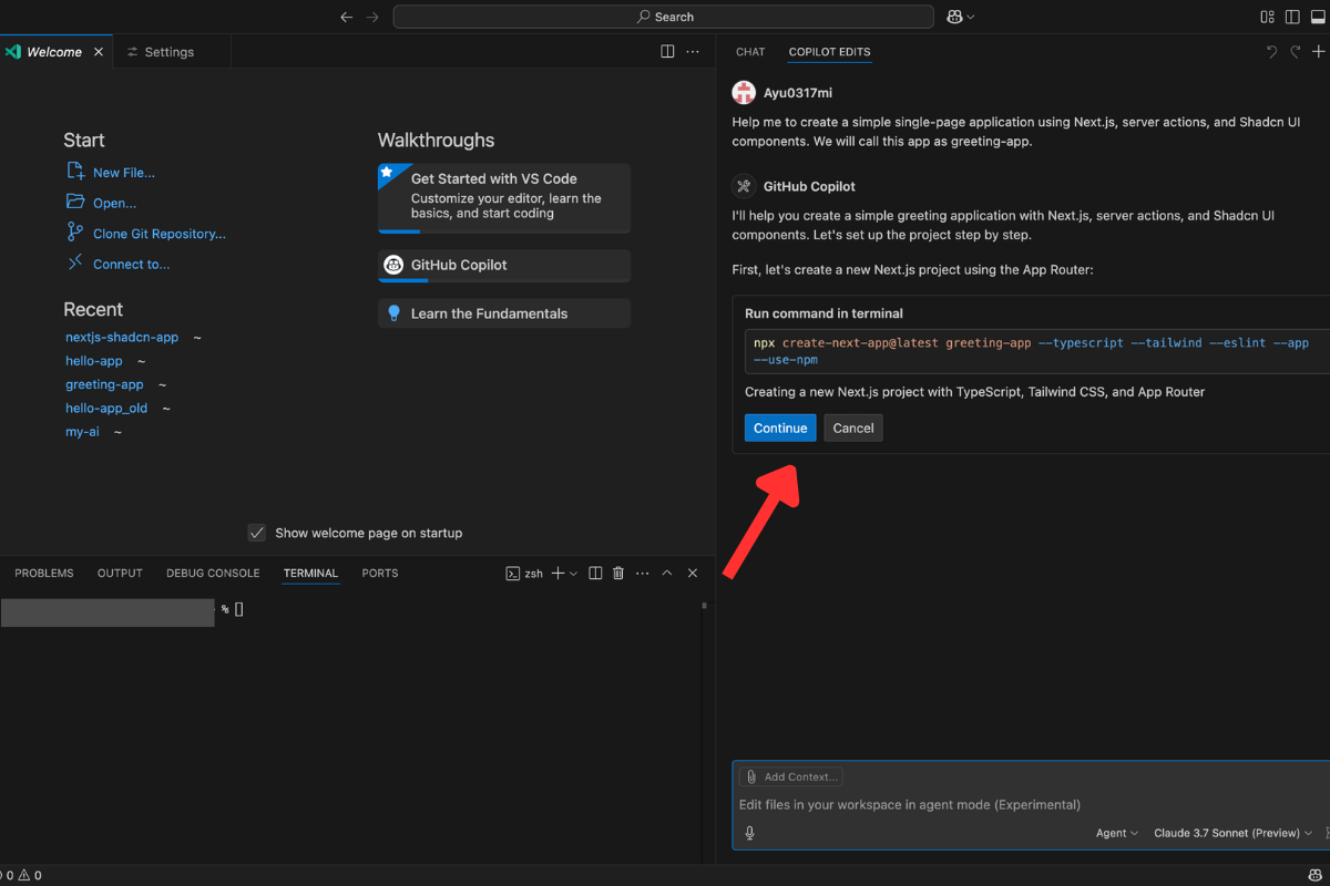
    Ok, time to build the app. I ask it to create a Next.js app with following command:

    Help me to create a simple single-page application using Next.js, server actions, and Shadcn UI components. We will call this app as greeting-app.

    In a secouds GitHub Copilot Agent respond to check with me if I want to run a code to create a project with Next.js. After click the continue button, it will automatically run the code on your terminal.

    While the GitHub Copilot Agent performs tasks automatically for me, it still gives me the option to accept or undo the changes. This provides me with great flexibility and control over my project’s structure.

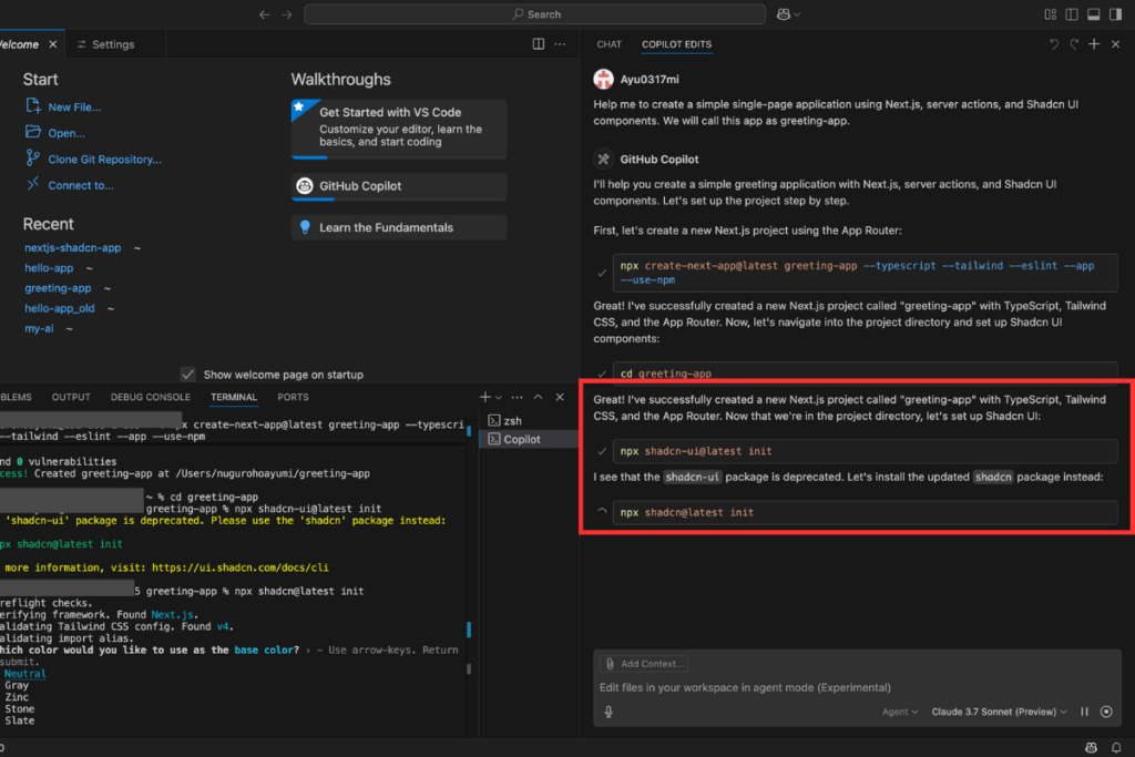
    In the next step, I was prompted to install Shadcn/UI in the project. On the first attempt, an error occurred because the ‘shadcn-ui’ package was deprecated.

    Agent Mode detected the error and automatically modified the package name. Without any additional commands, it troubleshot the issue and corrected the code.

    Agent Mode showed me the next step to create a directory and a file to handle the app functionality.

    GitHub Copilot Agent troubleshoot the errors automatically

    Facing the model errors

    It seemed like Copilot Agent was trying to create the directory and file, but it kept loading and didn’t respond to the command. I tried restarting the project and asked it to help me implement the server action, but it still wasn’t working. So, I decided to wait for about 15mins before continuing.

    Copilot stop generating the response

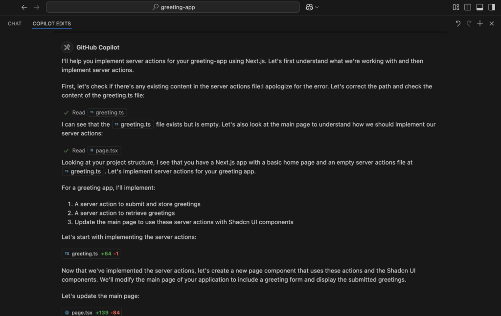
    After about 15 mins, I click the reload button on the chat space and now it’s working. It start from searching if there’s any existing content in the server actions file.

    It first analyzed my project structure, checking the relating files to server actions. It identified that the greeting.ts file was empty and suggested implementing server actions to submit and retrieve greetings. Additionally, it proposed updating the main page to integrate these actions using Shadcn/UI components.

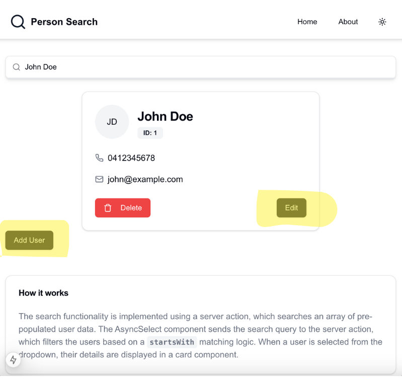
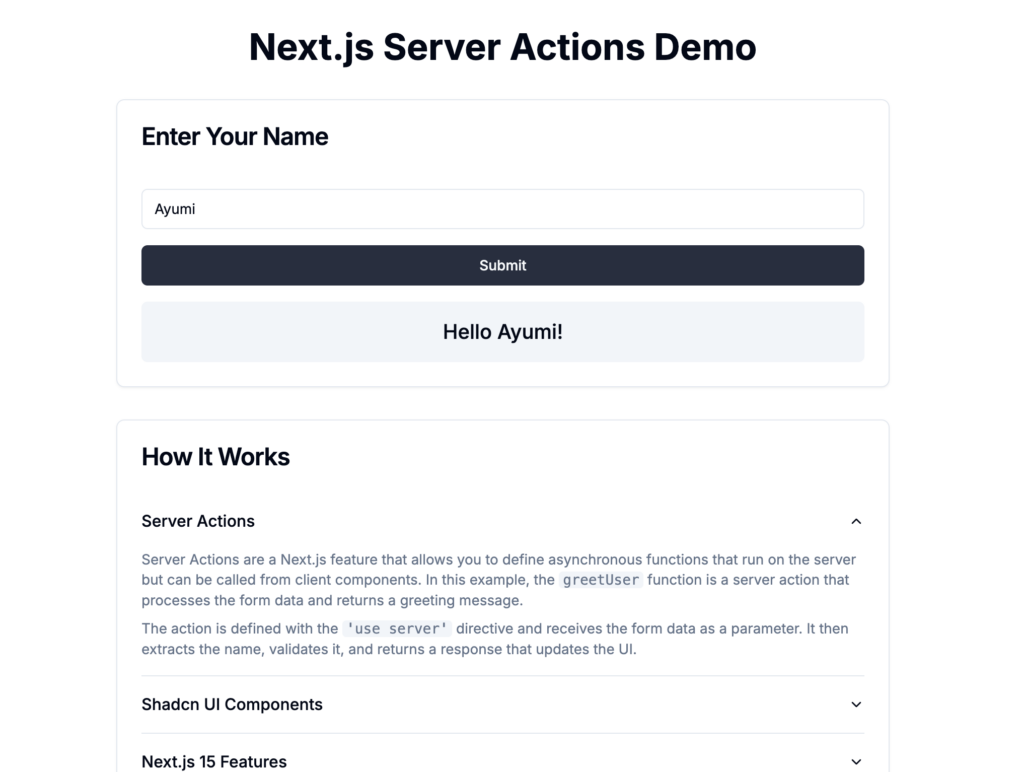
    Copilot Agent modified the main page by adding a greeting form and a list to display submitted greetings. It implemented server actions and integrated Shadcn/UI components for a better user experience. After checking for errors, it confirmed the code was ready to use, with an explanation to suggest using Database in a production. Let’ see how the app looks like now.

    GitHub Copilot Agent analyze the project files
    Summary of the changes

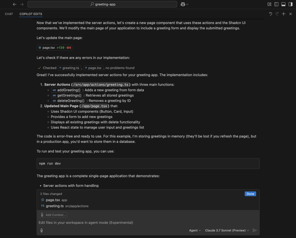
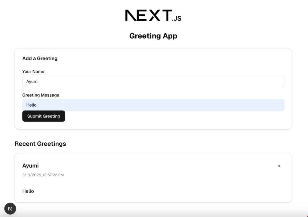
    With just few commands I gave—this is the result. The page includes Shadcn/UI input, button, and card components, all installed automatically by GitHub Copilot Agent. I didn’t specify the exact layout, at this moment but it generated the necessary components to display greetings and even added a recent greetings history.

    hello $name app built with GitHub Copilot Agent Mode


    Style up the page

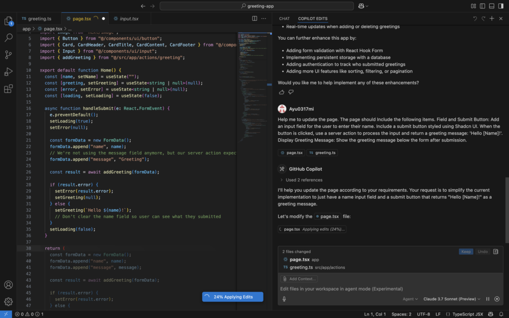
    Let’s see if I can style it to match the version I created on v0. dev Following the same instructions, I ran a few commands to test its capabilities.

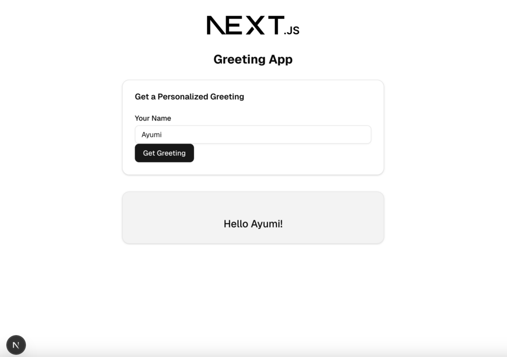
    Help me to update the page. The page should Include the following items. 
    Field and Submit Button: Add an input field for the user to enter their name. 
    Include a submit button styled using Shadcn UI. 
    When the button is clicked, use a server action to process the input and 
    return a greeting message: 'Hello [Name]!'. 
    Display Greeting Message: Show the greeting message below the form after 
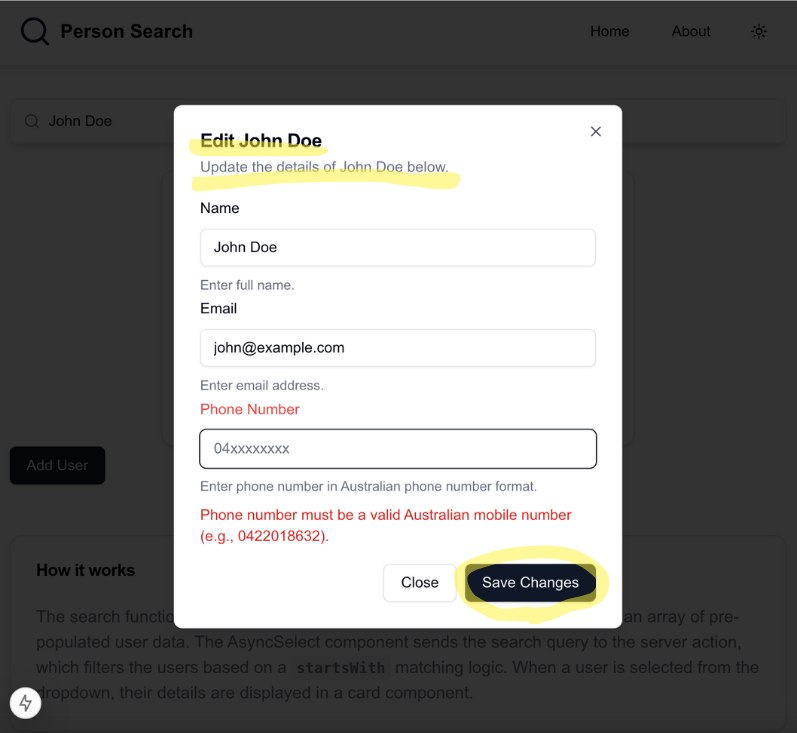
    submission. 

    I could see the updates happening in real-time in my workspace. Once the process was complete, it highlighted the modified sections, allowing me to review and either keep or undo the changes.

    Real-time updates
    User can accept or undo the changes

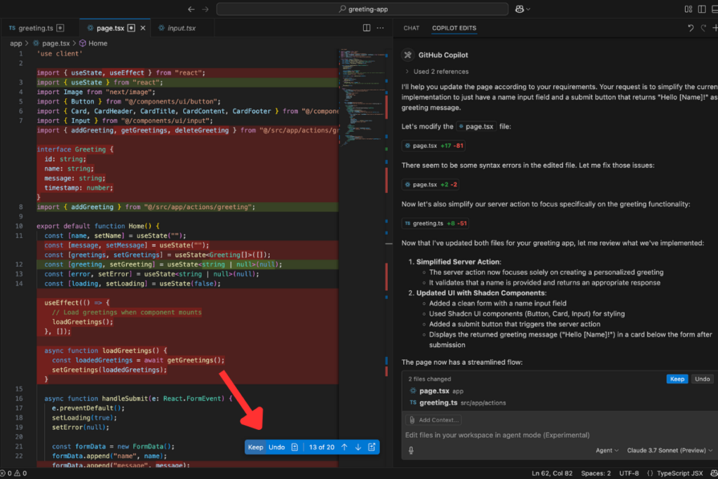
    The final result looks great! The app is now streamlined with a single input and button, displaying “Hello [Name]!” as the output.

    hello $name app now has a single input and button


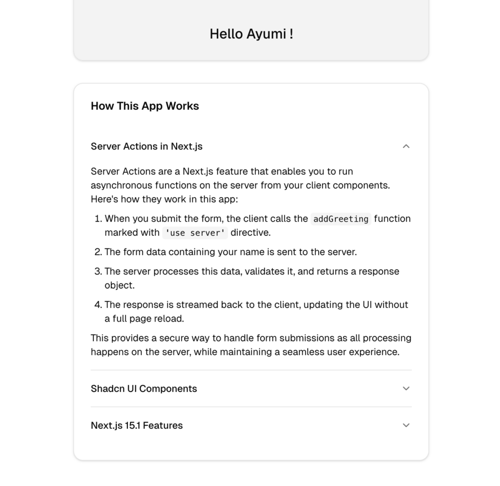
    Next, I want to add an explanation section using Shadcn/UI‘s Card and Accordion components for styling. To do this, I ran the following commands:

    Help me to add Explanation section on the page. Use Shadcn UI components 
    (Card or Accordion) to style this section. 
    Cover the following topics: 
    How server actions process the input and return the response. 
    The Shadcn UI components used. 
    Key Next.js 15.1 features involved in 
    the implementation. 

    The result?—It’s amazing. First, it checked whether the necessary Shadcn components were available, then installed them for the page.

    Now, the explanation section is beautifully styled with Shadcn/UI’s Accordion components.

    What’s fascinating is that it even generated content for the each topics I wanted to cover.

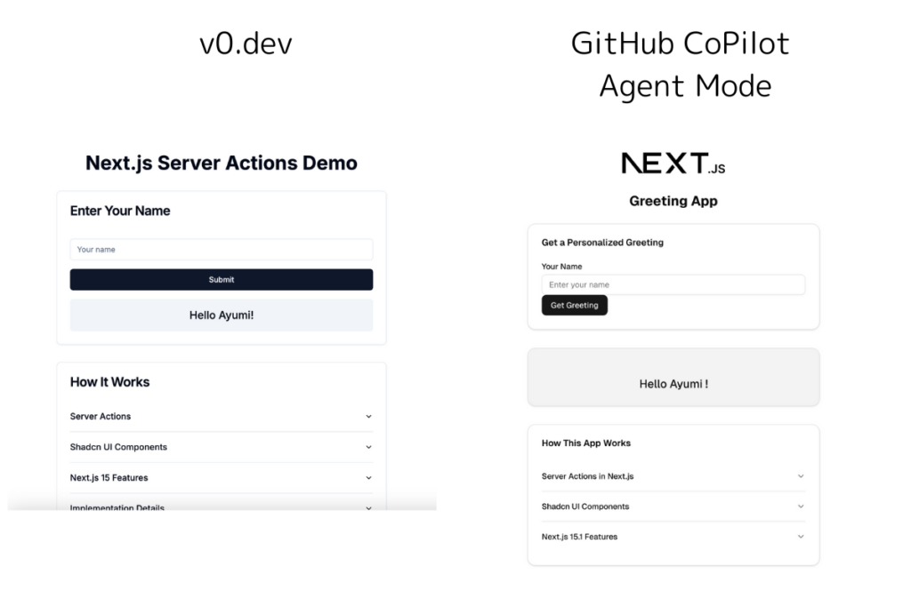
    This is a comparison between v0.dev and GitHub Copilot Agent Mode. There are a few differences in the styles, such as the submit buttons, but overall, the basic layout is quite similar. I was able to build the app with the same functions using GitHub Copilot Agent Mode.

    You can use the instructions to do this yourself. Find the instrctions on this course:

    Next.js 15 for Beginners: Build, Style, and Deploy Your First App with Shadcn UI and Vercel


    Thoughts for using GitHub Copilot Agentic Mode

    After using GitHub Copilot Agent Mode, I’m genuinely impressed by how effortlessly it can bring an app idea to life. With just few commands, it not only built the app but also installed the necessary dependencies without me having to do any manual setup.

    What stood out the most was its ability to analyze my project structure, detect issues, and fix them automatically. Instead of constantly switching between the terminal and my editor, I could watch it troubleshoot problems in real time, making the entire development process much smoother.

    Compared to the earlier version of Copilot, Agent Mode feels like a real coding assistant. It asks for permission before installing dependencies, giving me control over what gets added to my project. It also highlights the changes it makes, allowing me to accept or reject them as needed.

    And the fact that it works directly in VS Code—a tool I already use daily—makes it even more convenient. Overall, Agent Mode feels like having an extra set of hands that understands my workflow and helps me move faster without sacrificing control.


    Relate Courses:


    Key Technologies Mentioned:

    Project Github repo : Hello $name App

  • Reusable Dialog Component for Add and Edit Operations

    Reusable Dialog Component for Add and Edit Operations

    “Add” and “Edit” again and again…

    In most applications, managing “Add” and “Edit” operations is a fundamental requirement. At first, I created separate modals for each entity—users, products, and orders—thinking it was the simplest approach. How this approach becomes increasingly difficult to maintain as the number of entities grows and leads to these problems:

    The problems

    • Code Duplication: Each entity (users, products, orders, etc.) requires a separate dialog for both adding and editing.
    • Inconsistent UI/UX: Since each dialog is manually created, UI inconsistencies may arise across different components.
    • Increased Maintenance Overhead: Any UI or functional update to modals needs to be replicated across all individual dialogs.

    What’s the typical Alternatives?

    Separate Add & Edit Dialogs

    Pros: Allows complete customization for each dialog.

    Cons: Leads to repeated code, inconsistency, and increased maintenance efforts.

    One Generic Dialog but Manually Configured Per Page

    Pros: Reduces some duplication.

    Cons: Still requires repetitive setup, and developers may need to pass multiple props repeatedly.

    Custom Hook for Dialog Logic

    Pros: Helps manage dialog state and form submission logic efficiently.

    Cons: Still requires individual dialogs per use case.

    A more scalable approach is to use a single, opinionated dialog component that dynamically adapts based on whether it’s being used for adding or editing. This ensures consistency while reducing redundancy, making it easier to maintain in the long run.


    Introducing MutableDialog

    The MutableDialog component addresses these challenges by offering a structured way to handle both “Add” and “Edit” operations within a single, reusable dialog box. It integrates seamlessly with React Hook Form and Zod for validation, ensuring robust form handling.

    This dialog component is “opinionated”—it follows a defined pattern that standardizes dialog interactions. While it simplifies development in many cases, it also comes with trade-offs, which we’ll explore later.

    Core Features:

    • Dynamic Behavior: Determines whether it’s in “Add” or “Edit” mode based on the presence of default values.
    • Standardized UI: Ensures a consistent user experience across different forms.
    • Validation Support: Uses Zod schemas to enforce validation rules.
    • Reusable Structure: Accepts custom form components, allowing flexibility within a predefined framework.


    Boosting your Productivity with ActionState<T>, Toast Notifications, and Type Safety

    The MutableDialog component also includes several features that improve error handling, user feedback, and code maintainability.

    1. ActionState<T> for Standardized Server Responses

    The ActionState<T> interface provides a structured way for backend or server actions to communicate success or failure messages to the frontend. This ensures consistency in error handling and additional data processing upon success.

    export interface ActionState<T> {
      success: boolean;
      message: string | null;
      data?: T;
    }
    • Consistent Error Handling: Since the backend always returns a standardized response, developers don’t need to manually check response formats.
    • Predictable Behavior: Ensures that every action (add/edit) provides a clear indication of success or failure.

    The data property in ActionState<T> allows additional information to be returned from server actions. This flexibility is useful for uUI updates or logging.

    Use Case: Update Person info

    Imagine a Person Search feature where admins can update a user’s details (e.g., name, email). Instead of just confirming the update, we return the updated user object so the UI can reflect changes immediately.

    Here’s how a server action might handle this:

    
    export async function editUser(data: { userId: string; name: string; email: string }) {
      try {
        const updatedUser = await prisma.user.update({
          where: { id: data.userId },
          data: {
            name: data.name,
            email: data.email,
          },
        });
    
        return {
          success: true,
          message: "User updated successfully.",
          data: updatedUser, // Returning updated user object
        };
      } catch (error) {
        return {
          success: false,
          message: "Failed to update user.",
        };
      }
    }
    

    Integrating with MutableDialog in Person Search

    When the edit action runs, we update the UI immediately with the returned user data.

    export function UserEditDialog({ user }: UserEditDialogProps) {
      const handleEditUser = async (data: UserFormData): Promise<ActionState<User>> => {
        try {
          const updatedUser = await updateUser(user.id, data)
          return {
            success: true,
            message: `User ${updatedUser.name} updated successfully`,
            data: updatedUser,
          }
        } catch (error) {
          return {
            success: false,
            message: 'Failed to update user' + (error instanceof Error ? error.message : String(error)),
          }
        }
      }
     }
    

    Instead of just returning a success/failure status, returning the updated object allows the frontend to display the latest data immediately, reducing the need for additional API calls. This approach ensures a seamless user experience with real-time updates.

    Explore Person Search App on GitHub: https://github.com/gocallum/person-search


    2. User Feedback with Toast Notifications

    The MutableDialog component integrates with toast notifications using shadcn/ui’s toast hook. This provides instant feedback to users when an action succeeds or fails.

    • Success Messages: When an operation is successful, users receive a confirmation message.
    • Error Messages: If validation or server-side errors occur, users are immediately informed.
    • Improved UX: Real-time feedback enhances user experience, preventing confusion and reducing unnecessary clicks.
    if (actions.success) {
      toast({
        title: "Success",
        description: actions.message,
        variant: "default",
      });
    } else {
      toast({
        title: "Error",
        description: actions.message || "Operation failed",
        variant: "destructive",
      });
    }
    

    3. Strong Type Safety with TypeScript Generics

    By defining MutableDialog as a generic component with T extends FieldValues, we enforce type safety and flexibility across different forms. This approach ensures that:

    • Form data structures are strongly typed, reducing runtime errors.
    • Validation schemas (Zod) and form values remain synchronized, improving developer efficiency.
    • Developers can reuse this dialog for multiple entities (users, products, etc.) without changing its core implementation.
    export default function MutableDialog<T extends FieldValues>({
      formSchema,
      FormComponent,
      action,
      defaultValues,
    }: GenericDialogProps<T>) {
    

    Using TypeScript generics makes it easier to enforce constraints and validate form inputs at compile time, ultimately leading to fewer bugs and more predictable behavior.


    MutableDialog usage : trigger buttons
    Highlight sections can be edit with MutableDialog

    Props Overview

    MutableDialog accepts the following props:

    • formSchema: A Zod schema defining the validation rules for the form.
    • FormComponent: A React component responsible for rendering the form fields.
    • action: A function to handle the form submission (e.g., adding or updating a user), utilizing ActionState<T> to standardize responses.
    • defaultValues: Initial values for the form fields, used for editing existing data.
    • triggerButtonLabel: Label for the button that triggers the dialog
    • addDialogTitle / editDialogTitle: Titles for the “Add” and “Edit” modes.
    • dialogDescription: Description displayed inside the dialog.
    • submitButtonLabel: Label for the submit button.

    This code defines the MutableDialog component that handles both “Add” and “Edit” operations dynamically by adjusting the dialog content based on whether default values are provided. Now, let’s look at how we can use this component in your application.


    Usage Example

    Here’s how you can use MutableDialog in your application:

    Step 1: Define a Zod Schema

    import { z } from 'zod';
    
    const userSchema = z.object({
      name: z.string().min(1, 'Name is required'),
      email: z.string().email('Invalid email'),
    });


    Step 2: Create a Form Component

    import { useFormContext } from 'react-hook-form';
    
    function UserForm({ form }) {
      return (
        <div>
          <label>Name:</label>
          <input {...form.register("name")} />
          <label>Email:</label>
          <input {...form.register("email")} />
        </div>
      );
    }


    Step 3: Use MutableDialog in Your Page

    import MutableDialog from './components/mutable-dialog';
    
    export function UserDialog() {
      const handleAddUser = async (data: UserFormData): Promise<ActionState<User>> => {
        try {
          const newUser = await addUser(data)
          return {
            success: true,
            message: `User ${newUser.name} added successfully`,
            data: newUser
          }
        } catch (error) {
          return {
            success: false,
            message: 'Failed to add user ' + (error instanceof Error ? error.message : 'Unknown error')
          }
        }
      }
    
      return (
        <MutableDialog<UserFormData>
          formSchema={userFormSchema}
          FormComponent={UserForm}
          action={handleAddUser}
          triggerButtonLabel="Add User"
          addDialogTitle="Add New User"
          dialogDescription="Fill out the form below to add a new user."
          submitButtonLabel="Save"
          defaultValues={defaultValues} 
        />
      )
    }
    

    Full tutorial of Mutable dialog can be found on this course : Click


    Pros & Cons of MutableDialog

    ✅ Pros

    • Simplifies Code: Eliminates the need for multiple modal components.
    • Consistency Across UI: Provides a uniform experience for add/edit dialogs.
    • Works Well for Standard CRUD Forms: Best suited for simple forms that require a dialog-based interaction.

    ❌ Cons

    • Not Ideal for Complex Workflows: If additional business logic or multiple steps are required, this component might not be flexible enough.
    • Limited Button Customization: If different button behaviors (e.g., separate “Cancel” and “Close” actions) are needed, additional modifications are required.
    • Toast Notifications May Not Be Desired: If a project has a different notification system, the built-in toast functionality may be unnecessary.

    Conclusion

    By introducing a dynamic, reusable dialog component, I streamlined the way forms are managed across the application. This approach reduces redundancy, improves maintainability, and ensures a consistent user experience.

    Whether you’re a solo developer looking to simplify your workflow or part of a larger team aiming for UI consistency, this solution provides a scalable and efficient way to handle “Add” and “Edit” operations seamlessly.


    Relate Courses:

  • Claude Code Review: How AI Coding Assistants Helped Me to understand Code

    Claude Code Review: How AI Coding Assistants Helped Me to understand Code

    Overcoming Challenges in Understanding a Codebase

    Starting on a new project can be overwhelming, especially for junior developers. One of the biggest hurdles is grasping the entire code structure. I’ve personally struggled with this when I first started working on an app, and I know many other junior developers face the same challenge. Understanding how different components interact, identifying key functions, and making modifications confidently can feel daunting.

    Anthropic recently launched an overview of Claude Code, detailing its capabilities in assisting with development tasks, debugging, and code explanations. In this article, I’ll share my experience testing Claude Code on a Next.js project and how it can help developers navigate complex codebases more efficiently.


    What is Claude Code?

    Claude Code is an AI-driven coding assistant designed to integrate directly into your terminal. It provides insights into your codebase, helping developers understand, modify, and debug their projects more effectively.

    Key Features:

    1. Explaining Code Structure – Claude Code can analyze and explain how different parts of the codebase work together.
    2. Modifying and Debugging Code – It assists in making changes and fixing errors across multiple files.
    3. Running and Fixing Tests – It can execute test cases and troubleshoot failing tests.
    4. Navigating Git History – Helps resolve merge conflicts, track changes, and manage commits.


    Getting Started with Claude Code

    Before setting up Claude Code, make sure your system meets the following requirements:

    Step 1: Prerequisites

    • Node.js and npm: Since Claude Code runs on Node.js, you’ll need Node.js 18+ and npm installed on your machine. If they are not already installed, you can download them from the official Node.js website.
    • Anthropic API Key: To use Claude Code, you’ll need an API key for authentication. Sign up on the Anthropic platform, generate your API key, and ensure it is properly configured.

    More details on system requirements and pricing can be found in Anthropic’s documentation: Claude Code Overview

    Step 2: Installation

    Once you’ve met the prerequisites, follow these steps to install Claude Code:

    1. Open Your Terminal: Launch your terminal (Command Prompt on Windows via WSL, Terminal on macOS/Linux).
    2. Install Claude Code Globally: Run the following command to install Claude Code globally on your system: npm install -g @anthropic-ai/claude-code This command will download and install the Claude Code package from npm.
    3. Authenticate: After installation, start Claude Code by typing: claude You’ll be prompted to complete a one-time OAuth authentication process. Follow the instructions to link Claude Code to your Anthropic Console account using your API key.


    Testing Claude Code in the App

    To evaluate Claude Code’s capabilities, I tested it on a Next.js application called Person Search. This app allows users to add and search for people from a pre-populated list and view detailed information about them.

    1. Open your App and run instance of Claude code on your terminal
    cd /path/to/project
    claude

    We are now be in the Claude Code interactive mode, where we can start issuing commands. Claude code has now access to all of the files in this repository.

    2. Activate your billing on your Anthropic account

    To start using Claude code you’ll need an API key for authentication. If this error shows on on your terminal, you need to sign up on the Anthropic platform, generate your API key, and ensure it is properly configured.

    Setting up your billing on anthropic console. Make sure you have enoght credit balance on your account.


    TEST 1: Ask for the project structure

    Let’s try the first command. I will ask Claude Code to explain the project structure. While I already know that this app allows users to add, search, and view details of people, I am not entirely familiar with how the codebase is organized. By running the command below, I want to see how Claude Code can explain of the project.

    
    > explain to me this project structure

    Claude Code provided the following response:

    Here’s a breakdown of its key components based on Claude Code analysis:

    • Next.js app router structure (app/ directory) Claude Code immediately identified that the project follows Next.js’s app router structure.
    • User search and management interface It includes a user search and management interface, featuring components for displaying, editing, and deleting users.
    • API routes for fetching people data API routes handle fetching people data, allowing the frontend to retrieve user information dynamically.
    • UI components using Shadcn/UI (components/ui/ directory) The UI is built using Shadcn/UI, with reusable components stored in the components/ui/ directory.
    • Command palette for search functionality The app features a command palette that enables users to search efficiently.
    • Theming support with light/dark mode It supports theming functionality, offering both light and dark mode options.

    Additionally, Claude Code pointed out that the project uses TypeScript, Tailwind CSS, and modern React patterns with client-side hooks.

    In less than 5 secounds, Claude Code provided a structured explanation of the project, confirming that it is a Next.js web application designed for person/user search functionality. Not only it knows what the app is for, but also it provides a deeper insight of the app.


    TEST 2: Ask for a High-Level Overview

    To see how Claude Code responds to different phrasings of the command, I ran the following line:

    
    > give me an overview of this codebase

    Claude Code provided the following response:

    While both commands give us similer insight of the app, I found there are some key differences in focus.

    Common Findings from Both Commands

    Both responses confirmed that this is a Next.js person search application that follows modern React patterns with TypeScript and Tailwind CSS. They also highlighted the use of Shadcn/UI for UI components and mentioned that the app supports light and dark mode themes.

    Differences Between the Responses

    AspectCommand 1: Project StructureCommand 2: Codebase Overview
    Primary FocusDirectory structure & component organizationFeatures, architecture, and recent updates
    RoutingMentions Next.js app router (app/ directory)Specifies Next.js 15.1 with Server Components
    FunctionalityHighlights user search, management, and API routesEmphasizes search with async filtering & CRUD operations
    UI ComponentsNotes Shadcn/UI components in components/ui/Confirms Shadcn/UI but also mentions form validation with Zod
    Data HandlingMentions API routes for fetching user dataPoints out server actions for data operations
    React FeaturesUses client-side hooks for state managementMentions React 19 concurrent rendering & client/server component separation
    Recent UpdatesNo mention of recent updatesLists toast notifications, TurboPack optimization, and dark mode support

    Key Takeaways

    • Command 1 (“Explain the project structure”) focused on how the project is organized, providing details about directories, components, and API routes.
    • Command 2 (“Give me an overview of the codebase”) provided a higher-level summary, emphasizing features, architecture, and recent updates.

    This comparison shows that Claude Code adapts its response based on the phrasing of the command, making it useful for different levels of understanding.

    In less than a minute, Claude Code provided me with a clear overview of the app by quickly identifying key components. This helped me speed up the onboarding process for the project.


    TEST 3: Finding the Right Files for Changes

    Understanding the project overview is already a huge help, but figuring out the right file or path to modify can still take time. For this final test, I want to see if Claude Code can help me quickly locate the correct files for making changes.

    Let’s say your manager asks you to update the styling of the User Detail Card in the Person Search app—how easily can Claude point you in the right direction?

    To help me identify the relevant files, I ran the following commands. At this point, I hadn’t specified any files or paths.

    
    > Help me find the relevant files.
    We need to update the User Detail Card. List all the files related to it.

    After running the command, Claude Code automatically creates a task to find all related files. During the screening process, you can see Claude’s file analysis progress in the terminal.

    As a result, Claude listed all the files related to the User Detail Card. I expected it would find user-card.tsx, but what’s fascinating is that it also found files containing components related to the User card without being given the project structure. Additionally, it explains the purpose of each file following the file paths. With this information, I now know which files to modify.

    Through these tests, Claude Code proved its ability to quickly analyze the project structure, provide a high-level overview, and locate relevant files. Test 1 highlighted its understanding of the Next.js app structure, while Test 2 showed how it adapts to different command phrasing, shifting from file organization to features and updates. Test 3 demonstrated its accuracy in finding specific files for modifications without prior knowledge of the codebase.


    Conclusion

    After testing Claude Code, I’m genuinely impressed by how well it understands and navigates a project’s structure. Unlike other GenAI tool I’ve used, which often require me to copy and paste snippets or repeatedly explain the project, Claude Code works directly within the repository, making the whole process much smoother.

    What stood out the most was its ability to quickly provide structured insights about the codebase without any extra setup. I can see this being incredibly helpful for junior developers, as it removes the initial struggle of figuring out where everything is. From my experience, having this kind of support can speed up onboarding and improve overall team efficiency, making it a valuable tool for any development workflow.